How America Out-Deindustrialised Europe
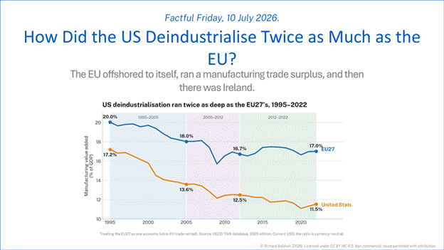
The EU offshored to itself, ran a manufacturing trade surplus, and then there was Ireland.
By Richard Baldwin, Saul Estrin and Bob Hancké, 10 July 2026. Factful Friday.
Introduction.
The US manufacturing share of GDP fell 5.7 percentage points from 1995 to 2022; the EU only 3.0. How did that happen?
The EU economy, they say, is over-regulated, over-taxed, and over-aged with decrepit, out-of-date factories. The US economy, they say, is high-tech, risk-loving, with cutting-edge factories forever reinventing themselves to stay at the frontier.
As it turns out, they said that sort of thing before looking at the data.
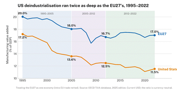
Figure 1: EU27 and US manufacturing value added as a share of GDP, 1995–2022.
Today’s Factful Friday breaks down how the US won the deindustrialisation race with the EU. It is written with Saul Estrin and Bob Hancké, who had the ideas and did most of the calculations.
In a hurry? Well even the Reader’s Digest version of the answer requires a bit of background. An economy’s deindustrialisation can be completely and perfectly broken down into three stories:
The slice: change in the slice of a euro’s worth of manufactured goods that is actually made in Europe, i.e. the value of the output that is left over after paying for imported inputs.
The trade: change in the share of domestic manufactures expenditure that falls on foreign goods.
The demand: change in domestic demand for manufactures (as opposed to, e.g., services).
Think of the economy as a bakery. It can lose business because the town stopped eating bread (the demand), because it switched to a cheaper imported bread (the trade), or because its own margins got squeezed by pricier flour (the slice).
Spoiler alert.
The American deindustrialisation story is mostly about the domestic demand for manufactured goods. Trade played a minor role. The slice actually pushed toward reindustrialisation.
In the European story, demand for manufactured goods barely moved (the demand decline in rich Western Europe was offset by rising demand in poorer Central and Eastern Europe). Trade was a plus: the EU runs a healthy surplus in manufactured goods. The culprit in the EU story is the slice. Almost the entire EU deindustrialisation was due to European factories keeping less of the value added per euro of manufactures produced.
One stark fact merits an in-text footnote: Ireland, a lovely country if there ever was one, is something of a statistical event in the world of manufacturing. More on that below, but to spark your curiosity, it’s known as “the double Irish with a Dutch sandwich.” We did not make that up.
Having covered the US deindustrialisation story in the 19 June 2026 column, we start with the EU27.
The EU deindustrialisation story.
EU27 here means today’s 27 member states, applied with a fixed composition across the whole period. The UK is excluded throughout, including the quarter-century in these data when Britain actually was a member.
That’s deliberate. Let bloc membership change over time and Brexit shows up in the data as a sudden “loss” of European manufacturing, which has nothing to do with deindustrialisation and everything to do with redrawing the map. Hold the map fixed and you isolate the economics. (For what it’s worth, Britain’s own manufacturing share fell from 17% to 9% over the same period; more than the EU27 average, and on the same demand-led pattern as the US. Its chart (see the G7 deindustrialisation Factful Friday) lines up suspiciously well with Brexit.)
Figure 1 shows the EU27 deindustrialisation happened in three phases: the slide, the bump, the plateau. The manufacturing share of GDP fell steadily from 20.0% in 1995 to 18.0% in 2005, kept falling through the financial crisis to a trough of 15.7% in the depths of the 2009 recession, but then clawed its way back to roughly 17% by the early 2020s, where it has more or less stayed.
Look closely at the 2009 trough and you’ll notice that the bloc didn’t just dip, it overshot on the way back up too only to glide back through 15.7%. That’s a 2.7-point swing in a single recession year: bigger than the entire “structural” decline of the following decade.
The decomposition.
To dig into the ‘how’ of the deindustrialisation, the next chart shows the three-way decomposition. The left panel shows the annual importance of the channels indexed so 1995 = 100. The trade and demand stories move vigorously but both end the period close to where they started. The difference is that demand dropped hard in the 2009 recession and largely recovered. The trade story pushed toward reindustrialisation through the 2000s but eased back later. The slice channel is the main event. It slides in a long, fairly steady decline of about 15% over 27 years and never really recovers.
The full period numbers can be seen in the right panel of the chart. Put the full period through the arithmetic and the answer is unambiguous. Demand accounted for −0.1 percentage points, essentially nothing. Trade for +0.2 percentage points, again very small. Slice is almost the entire story, with its −3.1 percentage points contribution to the -3.0 pp fall.
We line this up against the American numbers in the right panel. The contrast is hard to miss. The US lost 5.9 points of manufacturing share to collapsing demand for manufactures and a further 1.2 to rising import penetration, clawing back 1.4 points because its slice actually rose. Europe’s experience is close to a photographic negative of that: demand barely moved, trade offered a mild tailwind throughout, and the whole three-point fall came from a shrinking slice.
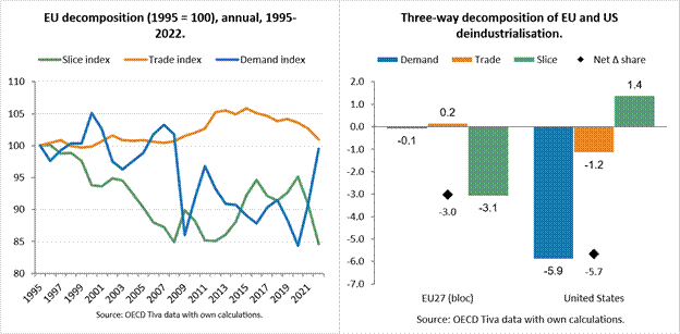
Figure 2: EU27 Three channel contributions (percentage point contributions to the deindustrialisation), annual index and full-period comparison with US included, 1995-2022.
Why the difference? Partly geography, partly the trade balance. The EU27 runs a growing extra-bloc manufacturing surplus. It has exported more manufactured goods to the rest of the world than it has imported every year in our time frame. And a good deal of the offshoring that did happen went internal, from Germany, France and Italy to Poland, Czechia, Slovakia and Hungary. That kept it inside the EU27’s own value-added accounting. America’s offshoring went to Mexico and East Asia. Europe built its own low-wage periphery inside the tariff wall.
Three phase decomposed.
As we saw, there were clearly three phases in the EU27 deindustrialising. The phases had their own decompositions, as Figure 3 shows.
The 1995–2005 phase saw an early slice collapse (−1.9pp), with demand and trade both quiet. This has the fingerprints of the “second unbundling” as one of us has called it (Baldwin, 2006). The ICT revolution allowed G7 firms to shift their manufacturing knowhow abroad and combine it with low cost foreign labour. Supply chains lengthened. Less value added stayed at home. This phase is also the decade of the EU’s 2004 enlargement, when ten new members, most of them low-wage economies by Western European standards, joined the Single Market. The timing is suggestive: this is precisely when Germany, France and the old industrial core started routing manufacturing stages eastward instead of to Asia.
The 2005–2012 phase was more balanced. The financial crisis bites. Demand turns sharply negative (−1.0pp) as Europeans simply bought less manufactured goods, while the slice keeps eroding, only partly cushioned by a rising trade surplus (+0.7pp).
The final 2012–2022 phase displays a modest reindustrialisation from 2012 (+0.3pp). The demand share rebounds (+1.1pp), the slice stabilises, and the earlier trade tailwind reverses (−0.7pp) as energy and intermediate-goods imports grow faster than exports.
That last point deserves un bémol. The bloc that built an ever-growing manufacturing surplus through the 2000s saw its self-sufficiency start eroding again in the 2010s. That was the decade of the post-2014 oil-price collapse, the post-2021 gas-price spike, and finally the 2022 energy shock that followed Russia’s invasion of Ukraine. None of this is visible in the headline 27-year number. It only shows up once you cut the data into phases. It’s also a reminder that “the EU’s energy problem” isn’t a single, continuous story. Cheap energy through most of the 2000s and 2010s coexisted with, and may even have masked, the same underlying slice erosion that a permanently expensive-energy Europe would have made far more visible far sooner.
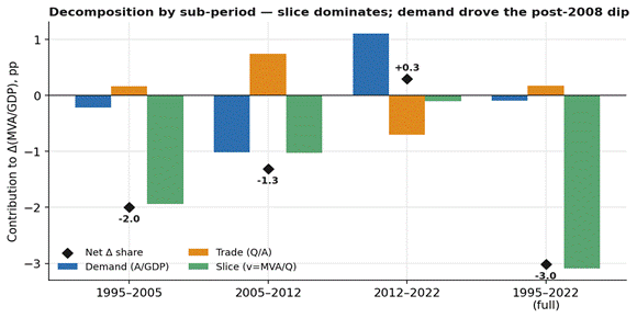
Figure 3: Channel contributions to the change in manufacturing share, by sub-period (pp).
Sector anatomy: chemicals and cars carried the bloc.
The European deindustrialisation has an important sectoral dimension, as the chart below shows. The TiVA data splits manufacturing into nine sub-sectors. Only two sub-sectors actually gained share. Chemicals, pharmaceuticals and refining added 0.3 points on the back of a genuine demand boom (pharma exports especially), and transport equipment added a further 0.2 points, also demand-led. Both are, not coincidentally, Europe’s extra-bloc surplus champions: the sectors where the continent is still winning export contests with the rest of the world.
Everyone else lost ground, but not for identical reasons. Textiles and apparel lost almost entirely on demand and trade, with essentially no slice effect – the textbook “Europeans buy it from Asia now” story. Basic and fabricated metals lost almost entirely on slice, the signature of a sector squeezed by input and energy costs rather than weak demand or import competition. Wood and paper, food, and electronics sit in between, mixing all three channels in smaller, less dramatic doses. As a check on the bookkeeping: the nine sub-sectors sum, to three decimal places, to the bloc-wide manufacturing total. The identity holds at every level of aggregation, which is reassuring given how much arithmetic is hiding behind these charts.
Two sectors are worth watching going forward. Metals is the sector the EU’s Carbon Border Adjustment Mechanism is explicitly designed to protect, on the theory that cheap, carbon-intensive imports are unfairly undercutting EU producers; the slice-driven decline documented here suggests the more immediate problem was the price of EU producers’ own energy bill, not foreign carbon dumping, which is a rather different policy problem with a rather different fix. And cars – Europe’s other surplus champion alongside chemicals – face a genuine 2020s threat that the 1995–2022 data can’t capture: a wave of cheap, competitive Chinese electric vehicles arriving just as TiVA’s data runs out. Whether car manufacturing keeps its positive sign in the next edition of this dataset is probably the single most important open question in European industrial policy.
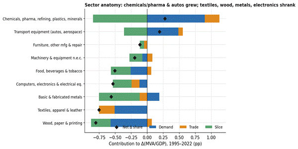
Figure 4: Contribution of each manufacturing sub-sector to the −3.0pp change, by channel (pp).
Country anatomy: three different European stories.
The EU27 is made of 27 vastly different economies, many of which are smaller in population than New York City. Their deindustrialisation sagas line up into roughly three lanes, as the chart below shows.
First come the legacy industrial core economies: France, Belgium, Sweden, Finland. They lost the most, six to seven points of GDP share each, and lost it America-style: demand-led. Germany and Italy were partial exceptions. Germany’s strong demand and trade positions nearly offset a steep slice decline, leaving its overall loss (under 2 points) the smallest of the big economies.
Then come the Central European ‘factory belt’: Poland, Czechia, Hungary, Slovakia. They have a genuinely different story since they were the factory economies to which the headquarter economies sent stages of production (along with the knowhow to run them).
Their manufacturing shares fell only modestly, one to three points, and the demand channel was actually strongly positive in every one of them: manufacturing grew faster than the rest of their economies. This is easy to understand as the low starting point and rapid income growth showed up in a boom in demand for manufactured goods. What dragged their shares down anyway was a large negative slice, the signature of catch-up integration into German-led supply chains, becoming the assembly stage for somebody else’s product, adding less value per unit of output even as the volume of work kept rising.
This is nothing more than Factory Europe. Cars made nominally in Germany are, in the value-added sense, increasingly made across Germany-Poland-Czechia-Slovakia-Hungary. The German engineering brand sits on top of a Central European assembly base. That’s a perfectly sensible competitive strategy for the bloc as a whole, and it’s a big part of why Europe’s trade channel never turned hostile the way America’s did.
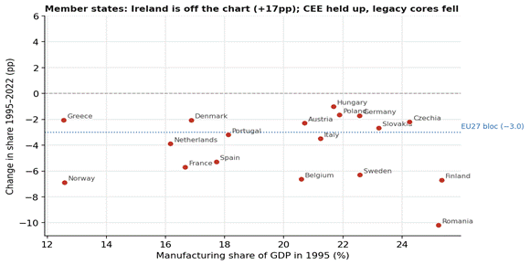
Figure 5: Member states plus Norway: 1995 manufacturing share vs. its change to 2022. Ireland (+17pp) is off-scale.
The Celtic tiger: double Irish with a Dutch sandwich.
Then there’s Ireland, which is very different. Its measured manufacturing share leapt upward from 22% to 39%, almost entirely on the back of US pharmaceutical and tech multinationals shifting intellectual property and production onto the Irish balance sheet for tax reasons. Ireland alone added roughly 1.1 percentage points to the EU27’s headline number; strip it out and Europe’s “true” decline is closer to 3.8 points than 3.0.
How did that trick work? The “Double Irish with a Dutch Sandwich” shifted profits and value added, much more than production. The idea was that by routing intellectual property income through Irish subsidiaries, multinationals inflated Ireland’s measured manufacturing value added without a matching increase in factories, jobs, or output. The way it saved them tax dollars is complex (and now illegal). (OECD, 2013).
A smaller, opposite-signed curiosity, for completeness: Norway. It sits outside the EU27 (though inside the EEA), and a reasonable guess might be that an energy-rich Nordic economy would flatter the bloc’s numbers if folded in. It doesn’t. Norway’s own manufacturing sector is small and getting smaller as a share of its GDP (12.6% in 1995, down to 5.7% in 2022) simply because its GDP is increasingly oil and gas, not factories. Blending Norway into the EU27 deepens the bloc’s overall decline slightly, from 3.0 to 3.3 points, and does so in every sub-period, not just the energy-price-spike years. Cheap energy didn’t rescue Norwegian manufacturing; it just made the rest of the Norwegian economy bigger around it.
Summary and concluding remarks.
Who knew? The dynamic economy deindustrialised faster than the sclerotic one.
This Factful Friday doesn’t say why, only how. But who can resist a conjecture or two. Maybe it’s because manufacturing is not the industry of the future and the US is getting there faster? Maybe it’s because manufacturing is not the sector where the good jobs are and without European dirigisme Americans flock to the good jobs? Or maybe it’s because the US has a different comparative advantage than the EU27?
The ‘how’ is what needs summarising. Run the same three-channel identity on the US and the EU27 and we get very different ‘culprits.’ America’s share fell 5.7 points because Americans stopped wanting more manufactured goods: the demand channel did −5.9 pp of the damage, the trade channel did another −1.2, and the only thing holding the line was the slice channel which actually pushed the other way.
Europe’s manufacturing GDP share fell 3.0 points via quite different channels. The demand channel barely moved (−0.1). The trade channel pushed slightly against the overall decline. The entire slide came from a thinning slice (−3.1).
So the Eurosclerosis story had it backwards. The dynamic economy shed factory share faster, and it did so for the one reason nobody blames: its own consumers shifted their spending patterns from goods to services. The supposedly sclerotic Old Continent? Europe did not stop buying manufactures, and it did not stop making them. It stopped keeping as much of what they were worth.
One caveat worth mentioning is that the topic at hand is the ratio of nominal values, so the relative price of manufactures compared to the other sectors has an impact. But note the comparison in today’s column as always been apples-to-apples. EU27 nominal ratio compared to the US nominal ratio. The real ratio analysis may show up in future Factful Fridays.
Closing remarks.
There is a policy angle here. Since 2025 the EU has staged its most ambitious turn to industrial policy in decades. Prompted by the Draghi Report’s warning of a widening competitiveness gap, Brussels has switched from referee to promoter: the Clean Industrial Deal, an Industrial Decarbonisation Accelerator Act, “Made in Europe” procurement rules, and new money for steel, chemicals, batteries and semiconductors. Much of the political energy behind it assumes Europe is being hollowed via trade and offshoring.
On this column’s evidence, that assumption is half right and half misdirected. The half that aims to bring down Europe’s energy costs is pointed straight at ’the slice’ channel which did matter. It was the one channel that actually did the damage, and the same energy bill that surfaced in the metals numbers earlier. The border-facing half, i.e., tariff walls, procurement preferences, defences against an import flood and the like, is aimed at a contest Europe never lost. Its appetite for manufactures held up. Its extra-bloc trade balance was a help, not a threat. Spend there and you are fortifying a flank that was never breached.
None of which means Europe can relax. A thin slice is a real loss; cars face a Chinese-EV threat the 1995–2022 data cannot yet see; and value that drains out through lengthening supply chains and a rising energy bill is value that stays gone. But the cure has to match the disease. And a good diagnosis requires the correct list of symptoms.
And that’s it for another Factful Friday!
References.
Ang, B.W. (2005), “The LMDI approach to decomposition analysis: a practical guide”, Energy Policy 33(7).
Baldwin, R. (2006), “Globalisation: the great unbundling(s)”, Economic Council of Finland.
Baldwin, R. (2026), “How the G7 deindustrialised.”, Factful Friday, 2 January 2026.
Baldwin, R. (2026), “What Actually Shrank American Manufacturing?”, Factful Friday, 19 June 2026.
OECD (2025), Trade in Value Added (TiVA) 2025 edition, Principal Indicators, reference area EU27_2020.
OECD TiVA 2025 edition, retrieved via the OECD SDMX API, June 2026. Charts and underlying panel available on request.
OECD. (2013). Addressing Base Erosion and Profit Shifting. OECD Publishing. https://doi.org/10.1787/9789264192744-en